Cascading Style Sheets (CSS) is a style sheet language used for describing the look and formatting of a document written in a markup language, most often used to change the style of web pages written in HTML. CSS is designed primarily to enable the separation of document content from document presentation, including elements such as the layout, colors, and fonts.
Using CSS
CSS can be added in different ways.
Slope Style
- Inline style attribute
<h1 style="color: #98c7d4;">CSS Cross Country</h1>
- In the
<head>
<head>
    <style>
        h1 { color: #98c7d4; }
    </style>
</head>
- External
<head>
<head>
    <title>CSS Cross Country</title>
    <link rel="stylesheet" href="styles.css" />
</head>
Selectors
Primary DOM selectors:
Element selector
HTML
<h1 class="intro" id="header">Nice and Toasty</h1>
CSS
h1 {
    color: #aba4ac;
    margin-bottom: 10px;
}
Class selector
HTML
<h1 class="intro" id="header">Nice and Toasty</h1>
CSS
.intro {
    color: #aba4ac;
    margin-bottom: 10px;
}
ID selector
HTML
<h1 class="intro" id="header">Nice and Toasty</h1>
CSS
#header {
    color: #aba4ac;
    margin-bottom: 10px;
}
Compound selectors
HTML
<h1 class="intro" id="header">Nice and Toasty</h1>
CSS
h1#header {
    color: #aba4ac;
    margin-bottom: 10px;
}
Cascade Order
Style priority is determined by position in site:
- External
<link> - In the
<head> - Inline style attribute
- Using !important
Above order represents Increasing Priority.
Priority is also dependent on position in document:
.intro {
    color: #444245;
}
.intro {
    color: #dddadd;
}
the second color definition for .intro overrides the first.
Non-conflicting properties will be combined:
.intro {
    color: #dddadd;
}
.intro {
    margin-bottom: 5px;
    width: 900px;
}
This can ve combined into:
.intro {
    color: #dddadd;
    margin-bottom: 5px;
    width: 900px;
}
Floating Left & Right
Let's look at how float works. Look at the following markup:
<article>
    <img src="ski.jpg" alt="Ski!" />
    To successfully ski, simply do not fall.
</article>
img {
    float: left;
}
So, floating removes elements from the document flow and moves them to a specified edge. The other content within the parent element will wrap around floats.

float: left / right / none
Stacking order
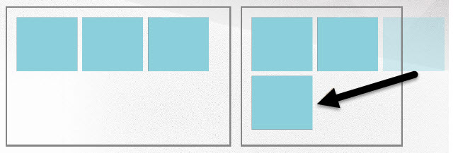
Floated elements stack up to the parent edge, then move down to the next available edge.

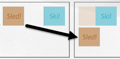
Take care with elements that have differing heights - the first available edge isn't always below.
<article>
    <img class="ski" src="ski.jpg" alt="Ski!" />
    <img class="sled" src="sled.jpg" alt="Sled!" />
</article>
.ski {
    float: right;
}
.sled {
    float: left;
}

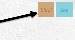
.ski {
    float: right;
}
.sled {
    float: right;
}
