With the release of iOS 7 design guidelines, app designers and developers will have to adjust the language to match the new "flat" design of iOS. In addition to the grid system, the dimensions of icons and commonly used elements, typography and iconography has been updated by Apple in many ways.
Here are the changes to the way you present your content.
Deference - UI should not compete with content. It should help the user to understand the content. Clarity -Legible text in anysize, precise and lucid icons, subtle adornments, and functionality focused design. Depth - Visual layers and realistic motion guiding user understanding. Whether you are creating a new app orredesigning an existing one, follow how iOS 7 design guidelinesapproached the redesign of the built-in apps:
- First, strip away the UI to expose the app’s core functionality and reaffirm its relevance.
- Next, use the themes of iOS 7 to inform the design of the UI and the user experience.Restore details and embellishments with care and never gratuitously.
- Throughout, be prepared to defy precedent, question assumptions, and let a focus on content and functionality motivate every design decision.
Display changes
1. The Grid System
2. Tables /Lists
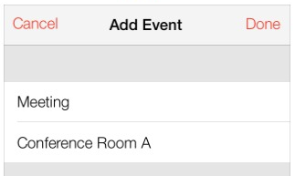
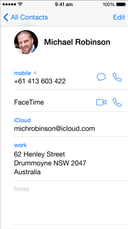
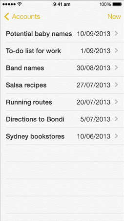
Tables, no longer have a container and uses the full width of the display now. Only the table headers are different from the context with different color highlighting the heading. Table items have a padding of 15pt either side, separated by a 1px line, margin 15pt to the left side and connect directly with the right side of the screen.
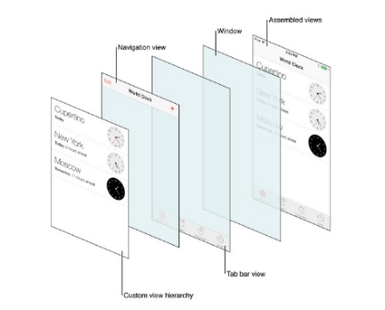
3. Layers
The new translucent UI layout consists of several different layers in one screen. allowing you to align navigation and tab bar views with a custom view hierarchy to create a new interface. .
4. Navigation, Status Bars Menus
Navigation bar includes a title, basic navigation and action buttons. The height of the navigation bar is shrunk to 32pt in landscape orientationto show more content below.
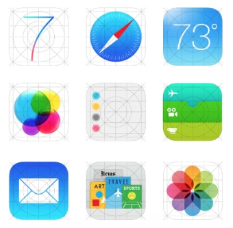
5. Icons
Icons have gone borderless. They are resizable for different screen sizes for example landscape vs portrait. iPad vs iPhone.
Take advantage of the whole screen in your design
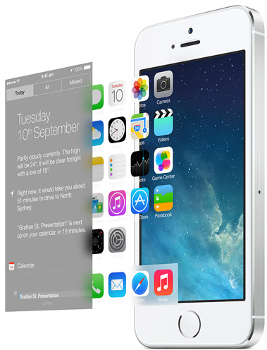
With the new transparent status bar, and the removal of insets and visual frames revealing more room, nowyou can extend the content to the edges of the screen. On screen keyboard, which hides part of the screen has been removed, and the hierarchical elements displayed in an translucentmanner, conveying content awareness.
Realism and visual indicators or Skeuomorphism is discouraged
Apple discourages the use of bevelled elements, gradients, and drop shadows. Skeuomorphism leads to "heavier UI elements that can overpower or compete with the content". Apple encourages to focus on the content with the UI playing a supporting role.
Depth to communicate hierarchy
Distinct and functional layers help create depth and establish hierarchy and order. The use of translucency provides a sense of context and place. And new approaches to animation and motion make even the simplest tasks more engaging.
Of course, Apple would like designers to adopt the same approach to authoring apps, making use of transparency and transitions to help communicate hierarchical position.It's a big leap in the way we think about app design, but it's probably won't be long before users of iOS7 start to expect it.
More white space
More white space helps to reduce the clutter and improve the clarity by exposing content and functionality. Apple iOS 7 design guidelines emphasize on creating apps with simplicity and plenty of negative space.
Meaningful Colors for the UI
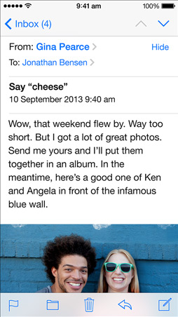
A theme of system colors, that work well with dark and light backgrounds, provide a meaningful visual cue for the built-in apps like yellow in Notes.
Dynamic system fonts
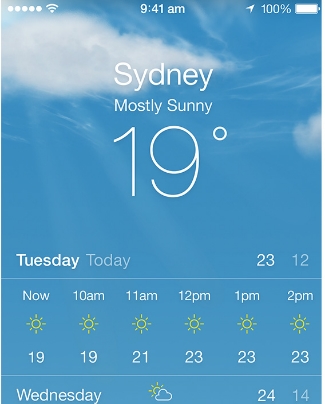
iOS 7 dynamic system fonts adjust letter spacing, font-weight and line height, enhancing readability at any size. For system or custom fonts, choose Dynamic Type so the app will respond to any text size. The updated Weather app for iOS 7 has the all-new dynamic type system with a full-screen view.
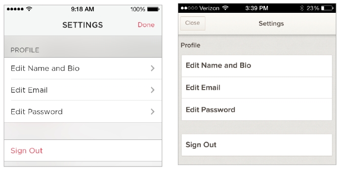
Borderless Buttons
In iOS 7, buttons have been simplified to look simple with one color, borderless and explaining context to indicate interactivity. All bar buttons are borderless.And when it makes sense, a content-area button can display a thin border or tinted background that makes it distinctive. In the Messages app, the navigation bar, contact and send buttons have been replaced with text labels.